
Quilt Nerd Alert!

The first time I saw Laurie Schifrin’s “Antelope Canyon” quilt I was struck by it. I collected as many photos of it that I could find – which isn’t very many as far as I’m concerned, get your finished quilt photos out there people! – and I marvelled at how the different colorways and value settings change its look. OK, that’s true of most quilts but Antelope Canyon has such GIANT blocks that it really gives you a bold modern graphic, even some optical illusion potential.
When Gruber’s Quilt Shop needed a model of it made – and I just happened to clerk there a few times a week – I signed up for it. They have the version for the “Texture Graphix” line of fabrics by Jason Yenter for In the Beginning fabrics. I am spelling that all out for you because I just helped open and shelve a *new* line of Texture Graphix by Jason Yenter in starker whites, blacks, and greys and they would ALSO make a great Antelope Canyon quilt! or any quilt – they’re just gorgeous. Of course, Laurie Schifrin’s already done another cool strippy design called “Mirage” and you can see it at that link too. And truly I don’t mean to sound like an advert, I just try to share all the details since sometimes a quilt maker wants *exactly the fabric* or pattern or whatever but doesn’t know the name.
If you’re still working on an Antelope Canyon quilt or plan to, here are my few tips:
- Label your pieces yes but just as importantly, to me, is underline *any* letter that could be mistaken for another letter upside down or sideways, this way you know which way is up for that letter. Pictured below is L and M, not 7 and W, or L and W. But *do not* let your masking tape (if that’s what you use) get onto the edge like my L tag here – it will make the fabric fray more than it might be inclined to. ugh! Do as I say not as I do, OK? Back to the letters, I recommend you underline at least H, I, M, N, P, W, Z. Then put sections of your pieces into plastic baggies or something to protect them until you sew with them. I just stacked mine into sections of the alphabet and then bagged each section and labelled the bag.

- Check your blocks regularly. It’s easy math with this one: the strips either finish at 1″ or 2″, so add ’em up and then on the outermost round add 1/2″ for your seam allowance. This way you will catch any BIG stitching errors before they get compounded. Here you can see a 4″ check on the middle of a block:
 The center square plus the first row are looking pretty good in this one. Then my 10″ check starts showing that my seam allowance was getting too big by a thread or two (which was *weird* because in some patterns my scant 1/4″ is too narrow since I use a 1/4″ blade foot for my Pfaff and then can adjust my needle to make it even a bit more scant):
 I did do some unsewing on the blocks a couple of times.
- Fraying along the way… In my initial pile O’pieces from chain piecing (where I always had my first and last pieces of any given set labelled) you can see that I don’t have much fraying, that’s a pretty good sign that I had the strips squared up decently – or so I thought.
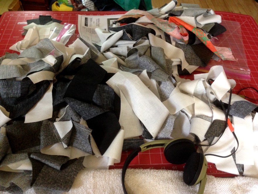 Whereas by the time I had my blocks together, I had a fairly hairy back!
 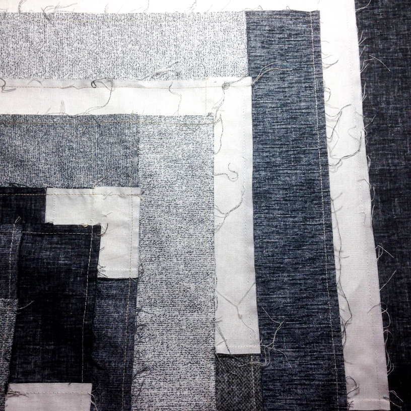 Some fabrics are just this way, but also a couple of spots are due to my masking tape hitting the edge. This really isn’t *too* bad (Not like wovens, I love wovens/homespun but talk about fray potential!) but I did try to trim and clean up most of this before giving the flimsy (top) to a long-arm quilter to baste and do some preliminary stitching for me before I do some handquilting. If it really bugs you, you could use some Fray Check on your edges and/or zig-zag baste or serge your edges.
- Lastly, I did not follow the general instructions to “try to get a good balance of colors and values”. I purposefully tried to get more lights on one side of the block and more dark fabrics on the other. This so far gave me what I see as a little more “movement” on the top:

My Antelope Canyon flimsy So does this top look a little more off-balance to you than some other Antelope Canyon quilts? I am hoping to emphasize the “spiral” effect that I see on it with some big stitch quilting.
Tell me if you see what else I did differently than the actual pattern. I will be interested to know who notices!!
(There are still a few kits of this version of the quilt at Gruber’s online store )
I hope this helps some of you out there in the quilting world! Let’s see those Antelope Canyon quilts!
Please visit my pattern shop at https://www.etsy.com/shop/MateriellaDesigns/
